

4.7 Visual Effects: MacBeth Meets Keylight
Visual Effects
MacBeth Color Checker Chart meets the Chroma Keyer
Color is complicated. Testing how each media reacts in a Chroma Keyer is fascinating and the results will demonstrate how important masking is when pulling a key! The Keylight node in Nuke was used for this portion of the experiment, along with Photoshop for the formatting. Color correction is also very beneficial downstream from the keyer before the final composite as demonstrated in this post.
It is to be noted that this image is cropped down (in post) from the larger scene in the previous post. Due to compression, proxy files were not used for this portion of the shootout. Only one frame is necessary for the test and is quite small in comparison to an entire clip.
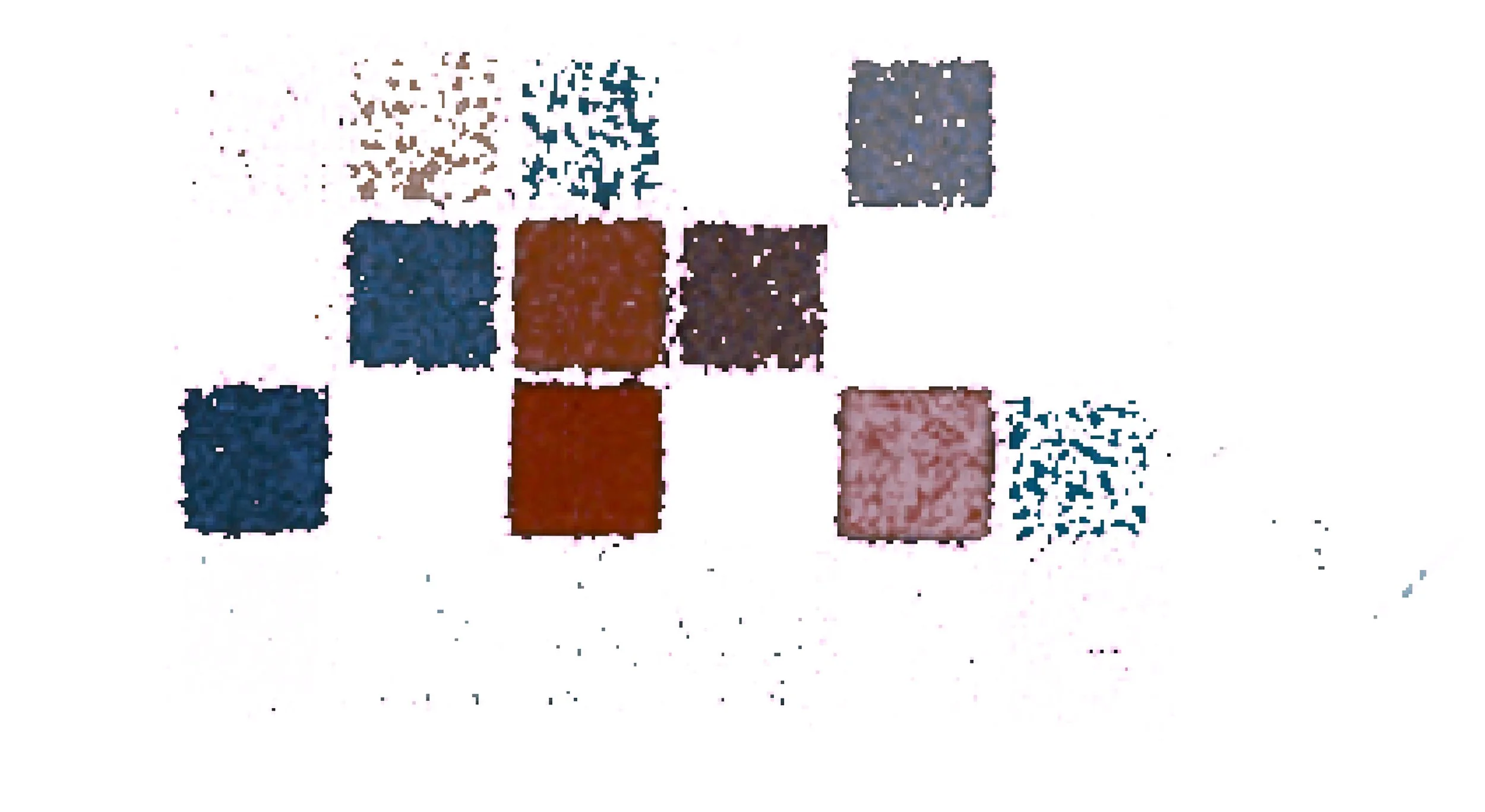
D21

Fig. 24.1 D21 Raw Color
Film

Fig. 24.2 Film Raw Color
The chart seen above from each camera, with the D21 on the left, and the Film on the right; already a difference can be seen in image quality. There is more noise in the film and it can be seen in each patch how much variation there is. Noise aside, there is an obvious color difference between the two images.
Now let’s compare the patches side by side.

Fig. 24.3 D21 Vs Film Color Chart
D21 on the left. Film on the Right
Comparing the two next to each other, there is clearly a difference in each patch. For the rest of this article, the color charts will be color corrected to compare the two on the same level.

Levels
Even when the black levels and white levels are set, there is still clearly a difference in color. A difference in color between the two cameras, and a difference in the overall film patches.
Introducing the Keyer
Below, you can see how the D21 raw footage compares with the keyed out footage in both the corrected and uncorrected footage.


Process:
After using Keylight, the original clip is placed over a solid magenta fill color. Any piece of the image that is the same shade of green as the background should now be magenta. The patches on the chart furthest away from green are pretty much left in tact and the line between the two sides is near impossible to see.
White reflects all wavelengths, so it is expected to see the grayscale patches with a hint of magenta in them since green has been replaced by magenta on the right side of each patch. By applying the Keylight, any ‘green’ color is taken away and it becomes transparent, allowing for the solid magenta color to show through.
The really interesting thing is how the Keylight node makes the color patches appear noisier. This could be because of how the camera sensor and the debayering algorithms create the images we see; or this noise could be coming from how the Keylight algorithm works to remove a chosen color, but this is unclear.


As a test, the Keylight node was aggressively set to include more colors around the selected green screen color. This shows how many of the patches survived the chroma key, and how many did not.

Film Color Chart

Levels Set
Raw vs. Color Corrected
The results are similar to the above D21 color chart; and not much different can be said about these photos, but they are displayed to be compared.
Normal Key


Aggressive Key


Comparing Everything
The same scene was shot with two different cameras at the same time from two slightly different angles; therefore the images will not perfectly line up. Given the amount of noise present in the film footage, it can be easier to tell the difference when comparing two patches next to each other as done in the images above.
Minimizing the influence of these things, it was imperative to make some modifications so that none of the background, or other distracting features can influence the comparison. The patches were all made to be the same size, by cropping and adjusting them in the way seen below. Some of the outer edges have a dark edge, which is totally fine, but now the inside edges are harder to distinguish! Unless, of course, the keyer is pulling out a significant amount of color that contributes to the overall color of the patch.
Notice how the Light Skin patch (#2) has no visual difference between the original (top left) and the keyed (top right) version. Blue Flower (#5), Periwinkle (#8), Moderate Red (#9), Red (#15), and Black (#24) all have no visual difference between the Original and keyed version of the patch on the D21; whereas the Orange Yellow (#7), Purple (#10), Magenta (#17) have a slight difference in the keyed out patch.
This is quite strange, as patch #17, the magenta patch should show no difference because it should be unaffected; however, because of the line between the two patches is there, this means there are a few pixels showing through of the edge of the patch. I have also overlaid some of the patches by a few pixels to give a soft edge on the difference between the patches. Some of them blend really nice, and others not so much. This can be seen in patch #7, Orange Yellow, as well.
The film patches are drastically different from each other, with the exception of a few unaffected patches; the noise present in the film really helps to hide some of the edges between the original and the keyed version.

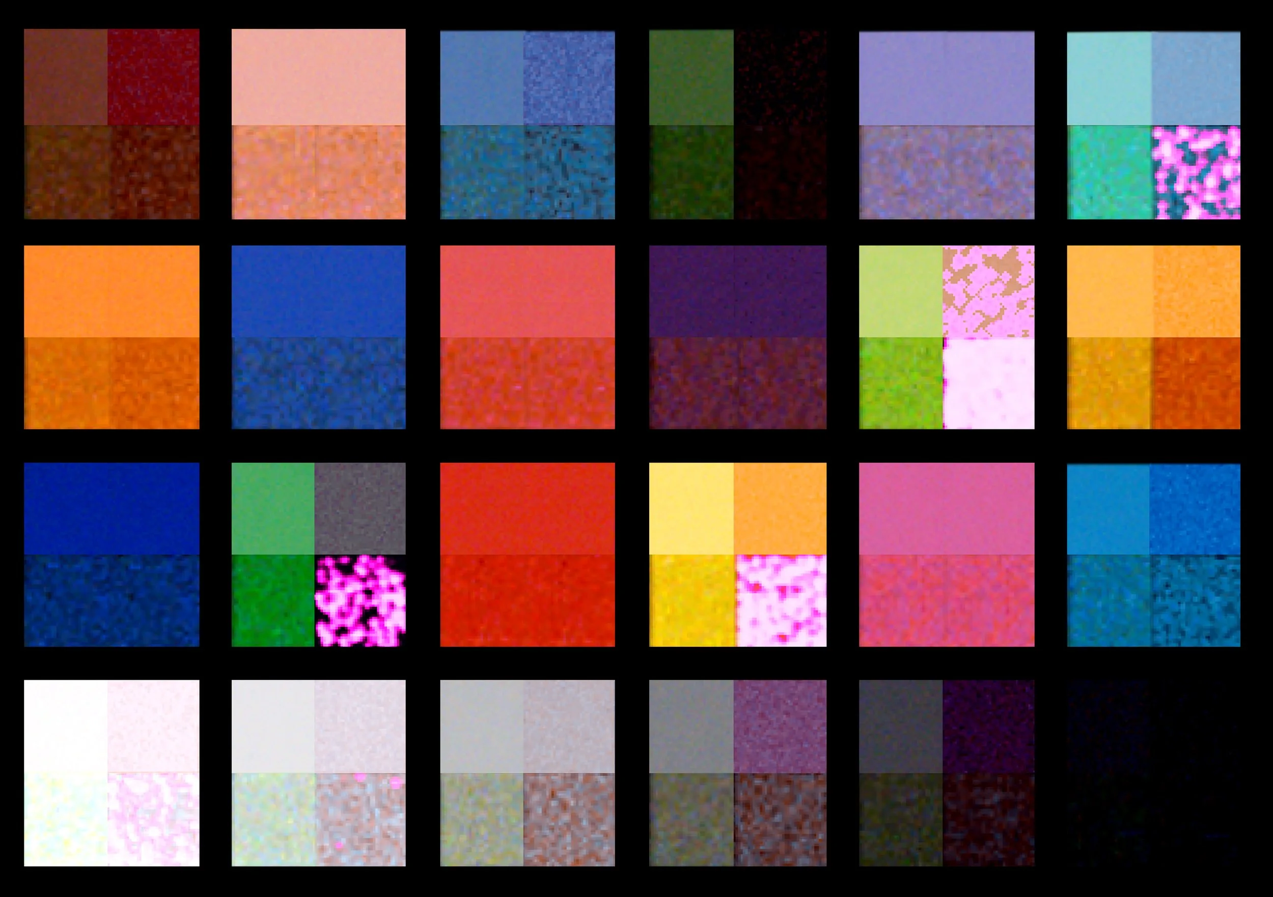
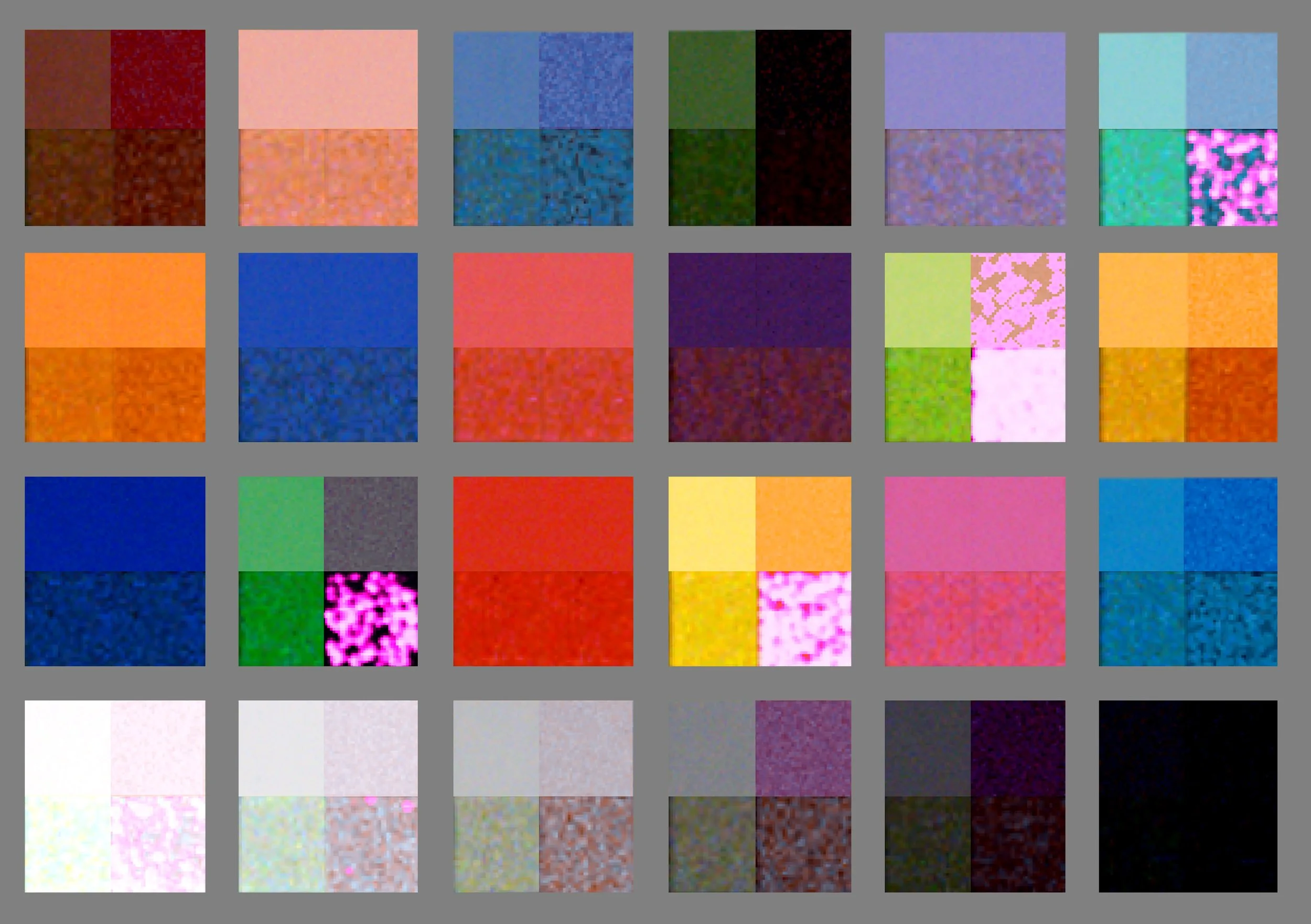

The noise is making a big difference on the background of the chart between the D21 and the Film chart; to minimize the influence this has, the background was eliminated. Black, mid-gray, and white are set as the background to give a different visual reference to compare the patches. The different color backgrounds change the contrast of the image and give different light adapted surrounds.
The left side of each patch is the raw footage.
The right side of each patch is the keyed footage.
The top part of each patch is the D21.
The bottom part of each patch is the Film.
The implications of this master comparison are quite intriguing and can be discussed a lot further; but this is something to continue reading about in the post about color reproduction from our colorist on the project.
The rest of this post will go over blend modes and how helpful they were for analyzing the color differences between the two cameras.
Blend Modes
The process here is to take the raw color chart and blend it with the keyed color chart (absence of green, magenta layer added beneath). If you take image A and blend it with image A (itself) using the subtraction or difference blend mode, the result should be entirely black (1 - 1 = 0).
So what happens when image A is duplicated (image B) and modified so that all green pixels are replaced with magenta?
Difference - Looks at the color information in each channel and subtracts either the blend color from the base color or the base color from the blend color, depending on which has the greater brightness value. Blending with white inverts the base color values; blending with black produces no change.**


Using the difference blend mode, it can be seen how much green is present in each patch.


Subtract - Looks at the color information in each channel and subtracts the blend color from the base color. In 8- and 16-bit images, any resulting negative values are clipped to zero.**
This is a good tool to see which image is brighter and has greater values in parts of the image and which parts are in range. Generally the difference blend mode is most helpful because after subtracting the two images, the absolute value is displayed.
Divide - Looks at the color information in each channel and divides the blend color from the base color.**


D21 Blend Mode Results


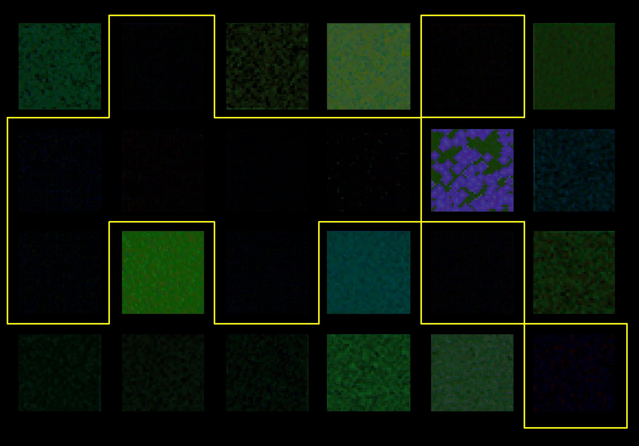

Film Blend Mode Results


Averaging the blend modes to find the patches with the most green-screen-green in them on both the D21 and Film can be found in these four highlighted patches, with the two brightly colored patches having the most of all green-screen-green. This graphic, even though the chart from the D21 is shown, represents both cameras.
Patches
Going back to the chart from an earlier post, we can now see the patches and which ones are most affected. Dark green being the four patches most affected, followed by the green and then the light green, with white being the most unaffected.
The numbers in the table are the differences between what the actual colors are on the chart, and how each camera differs from that. The numbers for this experiment are not relevant, but it is interesting to compare them.
Another interesting conclusion from the color chart blend mode experiment is that the patches with the most green-screen-green are different from the foliage patch! It appears that the average color in the four green-screen-green patches are brighter than the average of the foliage patch. This was done in Photoshop using the eyedropper tool, and visually comparing the results.

Master Color Chart Comparison. Click to enlarge
Conclusion
The Macbeth Color Checker Chart shows when a key is pulled from any footage that other color will be affected! This can have other implications for the composited shot, and for the colorist; but in general when doing green screen work, it is good practice to use an inner matte on the subject so that color is not affected.
The process for this was to see how color was affected, and not go into advanced settings on the keyer to get a good result; but shows how color changes when there is no inner mask and attention to detail is left out. Some of these photos were not included in the original paper (2015) because of how tight the deadline was.
If you made it through this lengthy post or the entire Shootout Blog, thank you for reading!
Feel free to reach out with questions about the project, or data and I will try to respond as soon as I can.
**This information for the blend modes in Photoshop can be found here on the Adobe page.
The definitions are copied/pasted onto this site.